Chai - Tea for Everyone
Branding
Motion
Packaging
Chai is an Indian tea company that aims to make high-end tea accessible to everyone.
Their brand stands for approachability, culture, nature, and quality.
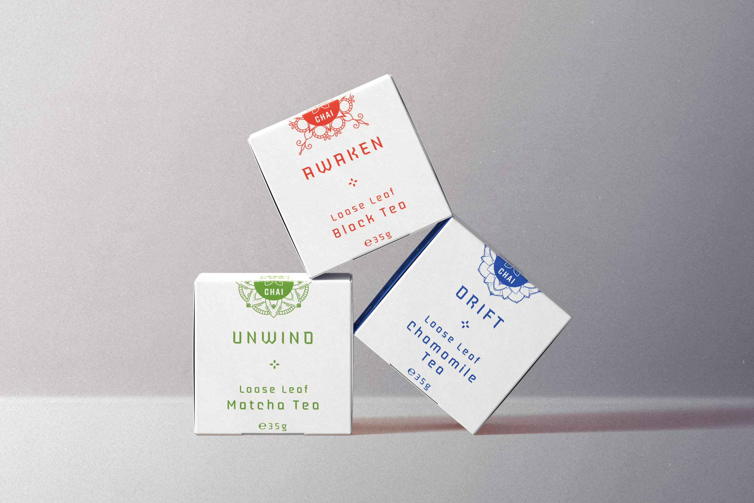
To create a logo in line with the core values of Chai, I first researched the symbolism of tea in Indian culture. Bringing this symbolism to the visual direction of the packaging helped create a cohesive and recognizable brand identity. One way to do this was by incorporating Mandalas into the packaging design, a traditional symbol of Indian culture that represents harmony, balance, and wholeness. Another approach was to add a seal to the packaging, emphasizing quality control.
The logo design needed to be simple yet memorable, with bold colours and typography that stood out. Combining traditional and modern design elements helped create a contemporary look that still honours Indian heritage.


Bringing symbolism to the visual direction helped create a cohesive and recognizable brand identity.



The packaging needed to be visually appealing and easy to recognize on the shelves. It incorporates elements such as natural motifs and colours that evoke a sense of warmth and comfort, conveying the approachability of the brand. The results are a package design and logo that reflect the core values of Chai while also appealing to a wide range of consumers.
What I did
Deliverables: Logo design, motion design, and packaging.
Tools: Adobe Illustrator, Adobe After Effects, and Adobe Photoshop.
Selected Works

TenorUI/UX

NANBranding

Matter: Your Mind 101Case Study

The Witcher: The Last WishBook Cover
Chai - Tea for EveryoneBranding/Packaging
NoriBrand Identity

Logofolio Vol. 01Branding

Form FunctionBranding