


Nori - Rebrand
Branding/Identity
Motion
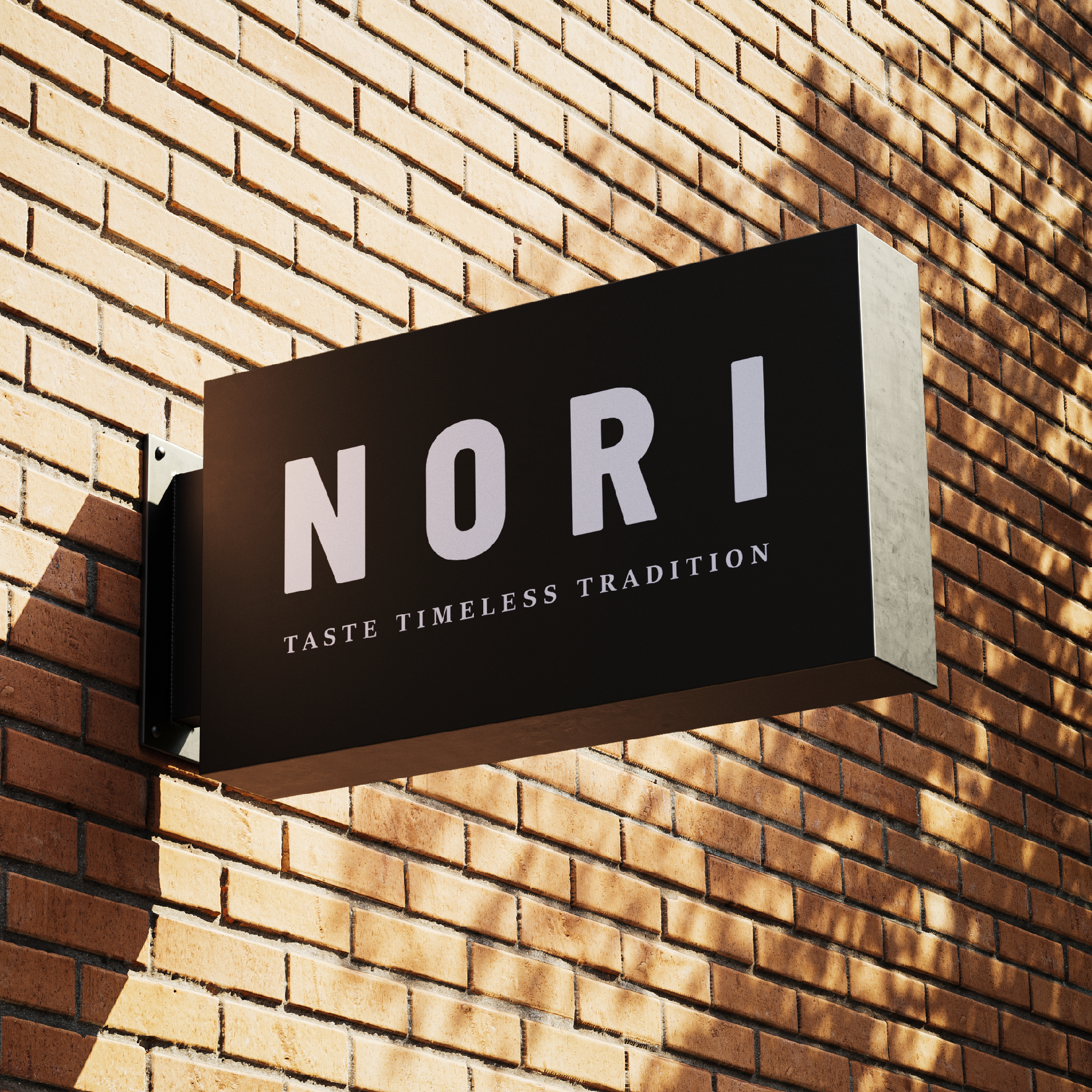
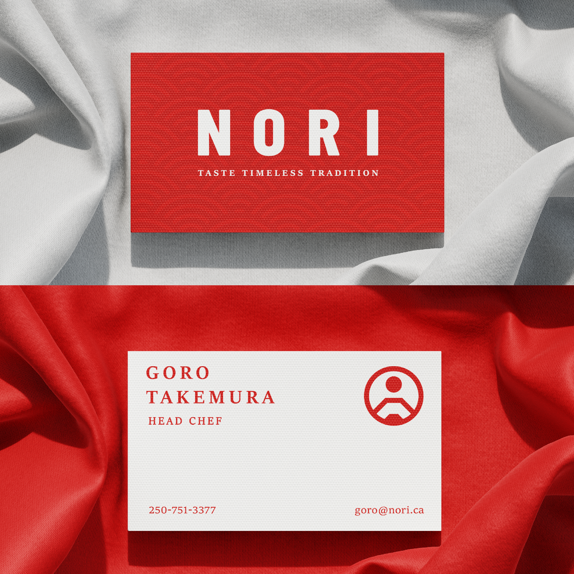
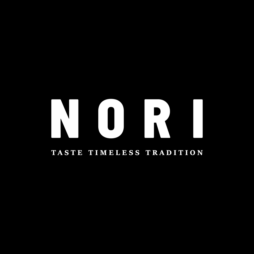
Nori is a high-end culinary establishment that specializes in Japanese Cuisine.
Their brand stands for respect, humility, and perfection rooted in Japanese culture.
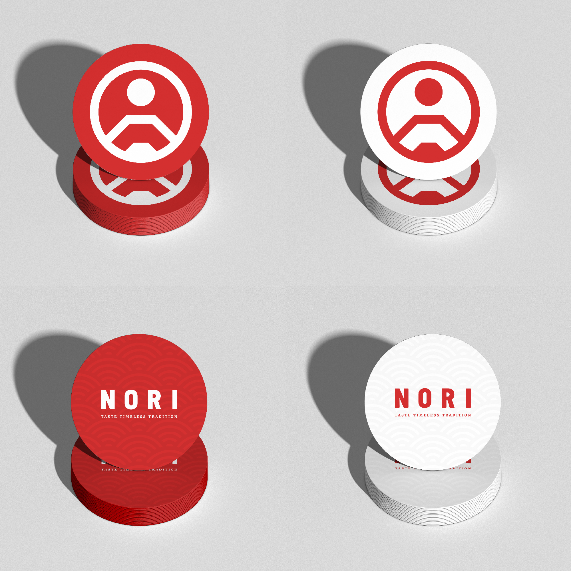
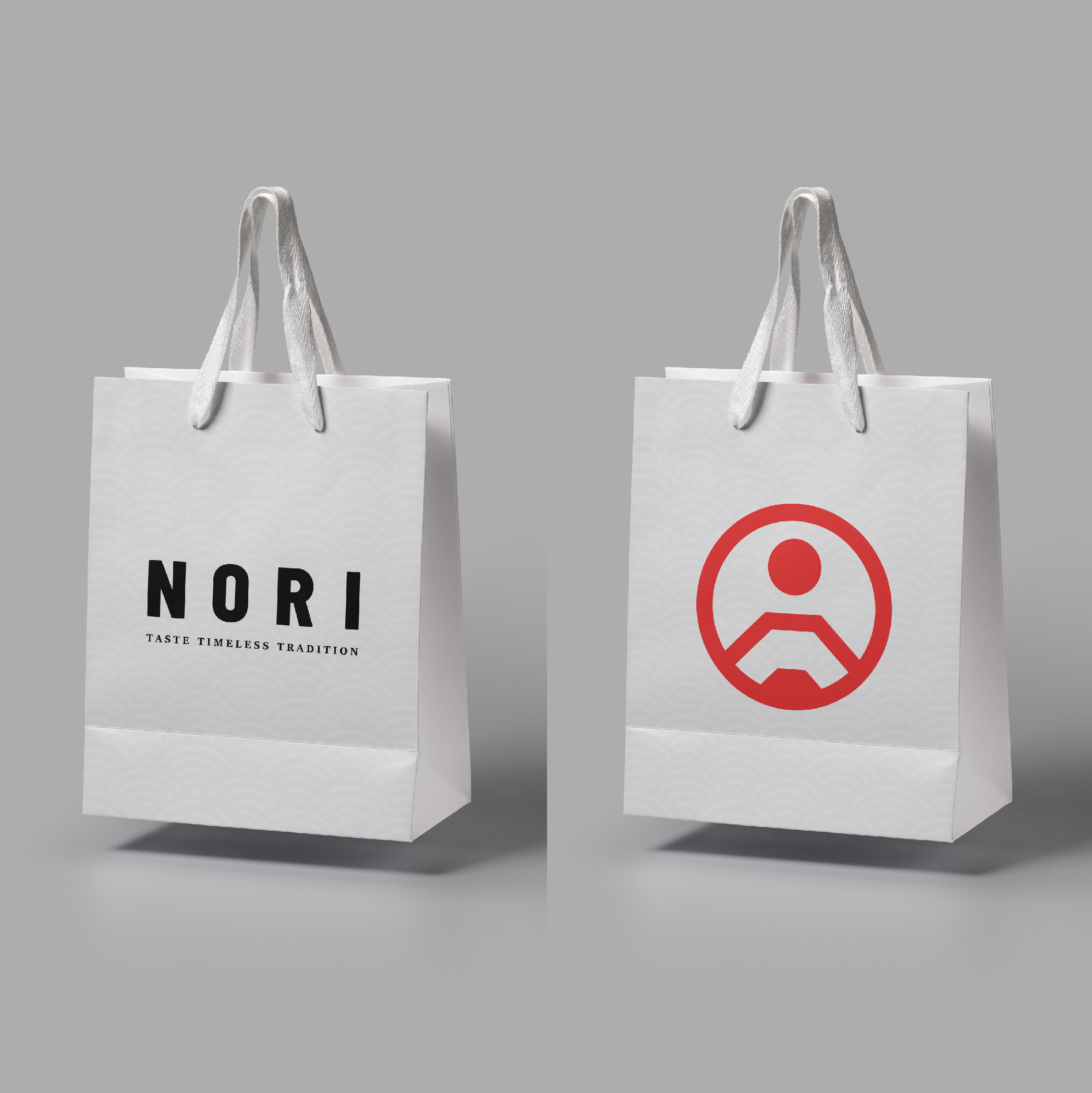
The logo pays homage to Japanese imperial seals; a visualization of Nori's commitment to delivering an unparalleled dining experience. The elements within the mark are representations of The Sun, Mt. Fuji, and Nori (edible seaweed).


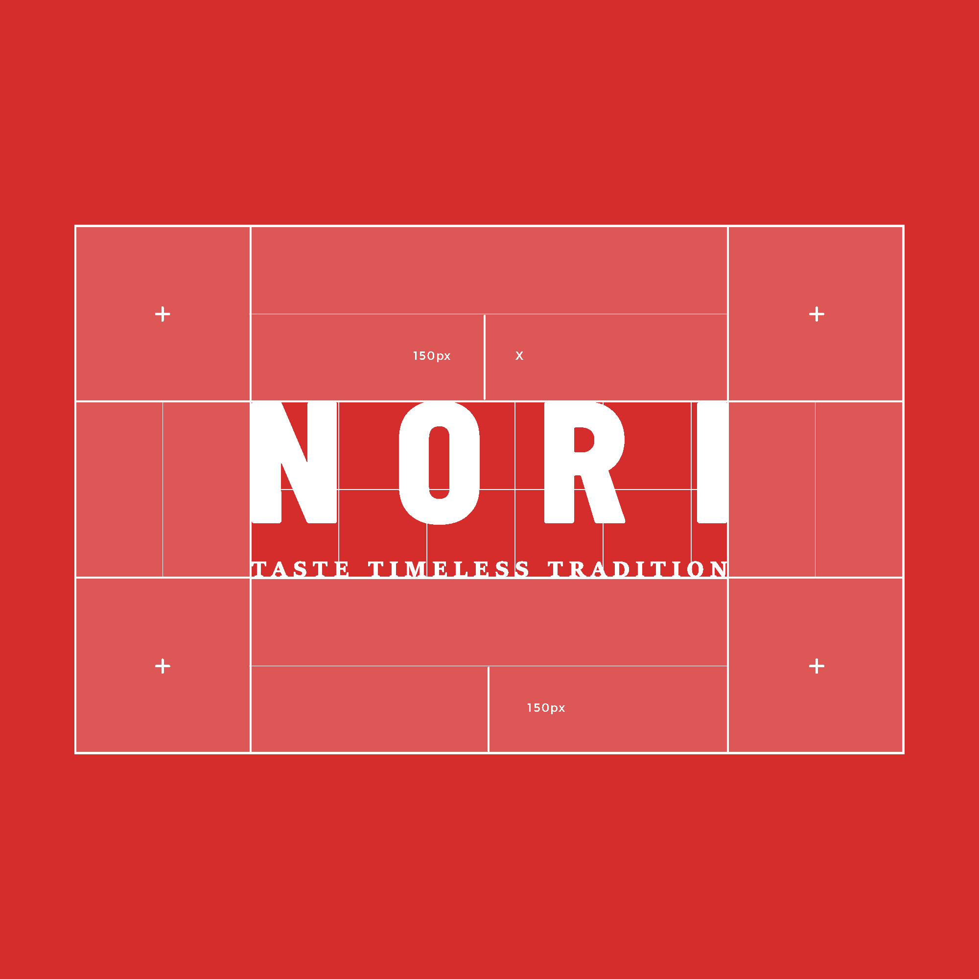
The wordmark is intended for when contextual restrictions demand such a form factor. Ideal usage would be on collateral where the brand has been pre-established through the primary mark.
Colours
The colour palette represents Nori's connection with Japanese culture.
It aims to create a traditional and authentic Japanese atmosphere, while also conveying a sense of refinement and professionalism.
- Red represents good fortune and prosperity in Japanese culture and is often used to draw attention to important elements.
- White represents purity, cleanliness, and simplicity, which are key characteristics of Japanese cuisine.
- Black symbolizes elegance, sophistication, and formality, which are also important aspects of Japanese culture.
What I did
Deliverables: Logo design, motion design, typography, colour scheme, and collateral.
Tools: Adobe Illustrator, Adobe After Effects, and Adobe Photoshop.
Selected Works

TenorUI/UX

NANBranding

Matter: Your Mind 101Case Study

The Witcher: The Last WishBook Cover
Chai - Tea for EveryoneBranding/Packaging
NoriBrand Identity

Logofolio Vol. 01Branding

Form FunctionBranding